Section 1: Two Sentences, Ten Years of Scars - Problem Understanding & Clarifications
Executive Summary: This section covers the opening minutes of a Staff/Principal interview built around the most familiar feature in software — a like button with a visible count. We decompose the two-sentence prompt across four dimensions (what, who, why, how), walk through five clarifying questions whose answers each kill a category of bugs, and meet the two symmetric ways candidates fail before any architecture exists. By the end, you'll have written assumptions, one deliberately unanswered question about accuracy, and a running example — Priya on the subway, double-tapping a pop star's post — that carries every hard problem in this module.
You sit down across from a principal engineer, ready for the planetary-scale classic — design Twitter, design a CDN. Instead, they give you this:
"Add a like button to posts. When a user taps it, record the like; tap again to remove it. Show the like count on every post. Design the backend."
Your first instinct is relief — you've tapped a like button ten thousand times. Your second should be suspicion, because familiarity is the trap: everyone has used a like button; almost nobody has defended one under a Staff panel's follow-ups. Candidates fail it in two symmetric ways:
- The Dismissal:
UPDATE posts SET like_count = like_count + 1and done, in ninety seconds. It dies three deaths: the first celebrity post turns one row into a lock-contention fire, the first double-tap counts twice, and the first network retry manufactures a like the user never confirmed. - The Citadel: Kafka, Flink, CRDTs, and a Lambda architecture — a fortress erected around a feature whose median post will receive roughly a dozen likes, ever. The interviewer said "scale" once, and judgment left the room.
The passing answer, built piece by piece across the next eleven sections, is neither: a boring, correct baseline that serves nearly every post, plus a surgical hot-post path that activates only when measured contention demands it — with that threshold named in advance, not discovered in an outage.
Key Insight: Deceptively simple prompts invert the usual test. "Design Twitter" asks whether you know enough machinery; "design a like button" asks whether you can withhold machinery until a number forces your hand. The Dismissal fails on correctness, the Citadel on judgment, and the interviewer scores both from your first question.
Decomposing the Two Sentences
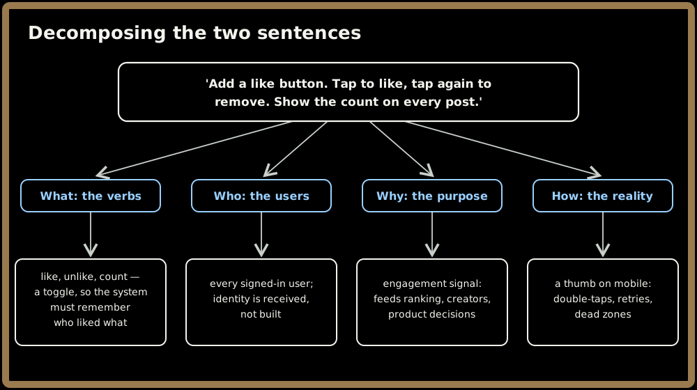
Before asking anything, map the territory. The same four-way decomposition that works on a payments network works here:
- What it does: Strip the prompt to its verbs — like, unlike, count. Notice the verb hiding in "tap again to remove it": this is not a counter, it's a toggle, and a toggle implies the system remembers who liked what, not merely how many. That observation becomes the spine of the whole design.
- Who uses it: "A user" means every signed-in person on the platform — identity arrives verified from elsewhere, and every like is scoped to it. (The Color Picker module in this same group walks that trust boundary in full; here it's one sentence and we move on.)
- Why it exists: A like is an engagement signal — it feeds creator feedback, content ranking, and eventually product and payout decisions. The why warns you this number may someday matter more than vanity, and that doors must be left open without being walked through today.
- How it's used: A thumb, a double-tap gesture, a phone on a flaky mobile network. That physical reality — taps that arrive twice, requests that retry, responses that die in tunnels — breeds half of this module's correctness problems.
Quick check before moving on:
Sign in to continue reading
The rest of this lesson is available with a free account. Signing in with Google or Microsoft is free.
Sign in to read the full lesson